Product Marketing Metrics Guide: Measuring PMM Impact with KPIs That Actually Matter
 Kris Carter
on
Kris Carter
on
The complete guide to measuring product marketing success. Learn which metrics matter by PMM function, how to build dashboards, prove ROI, and establish benchmarks that demonstrate real business impact.
Product marketing has a measurement problem. Everyone knows PMM is important, but measuring its impact is notoriously difficult.
You can't just track "awareness" or "engagement." Those might be marketing metrics, but PMM's impact is deeper: Did the launch drive pipeline? Did enablement increase win rates? Did your positioning help sales close faster?
This guide breaks down exactly which metrics matter for each PMM function, how to measure them, what good looks like, and how to build dashboards that prove your impact to executives.
The Core Principle: Measure Business Outcomes, Not Activities
Bad PMM metrics track activity:
- "We created 12 battle cards this quarter"
- "We delivered 8 sales training sessions"
- "We published 24 blog posts"
Good PMM metrics track outcomes:
- "Win rate against Competitor X improved from 45% to 62% after battle card rollout"
- "Reps who attended advanced training close 23% faster than those who didn't"
- "Featured launch drove $2.3M in pipeline in first 30 days"
Activities are inputs. Outcomes are what matters. Always measure the business result, not the work you did.
Product Launch Metrics
Launches are the most visible PMM work. Here's how to measure them.
Pipeline Generated
What it measures: New pipeline created as direct result of launch
How to track:
- Tag opportunities with launch campaign source
- Track MQLs/SQLs from launch content and campaigns
- Use UTM parameters and campaign attribution
Good looks like:
- Tier 1 launch: $1M-5M+ pipeline in first 90 days
- Tier 2 launch: $250K-1M pipeline in first 90 days
- Tier 3 launch: $50K-250K pipeline in first 90 days
Varies by: ACV, sales cycle length, market size
Dashboard view: Pipeline by source/campaign, trending over time
How to improve:
- Better targeting of launch campaigns
- Stronger value proposition in messaging
- More effective demand gen partnerships
- Earlier sales enablement
Feature Adoption Rate
What it measures: Percentage of eligible customers using new feature
How to track:
- Product analytics (Pendo, Amplitude, Mixpanel)
- Track activation events for new feature
- Segment by customer cohorts
Good looks like:
- 30 days post-launch: 15-30% of eligible users tried feature
- 90 days post-launch: 30-50% of eligible users are active users
- 180 days post-launch: 40-60% steady-state adoption
Varies by: Feature type (core vs. advanced), user type (power users adopt faster)
Dashboard view: Adoption funnel (aware → tried → active → retained)
How to improve:
- Better in-app messaging and education
- Targeted email campaigns to non-adopters
- Sales/CS outreach to high-value accounts
- Product improvements based on feedback
Sales Velocity Impact
What it measures: Change in sales cycle length after launch
How to track:
- Compare average days to close before and after launch
- Segment by deal size, region, sales rep
- Track specifically for deals where new feature was key
Good looks like:
- Major feature: 10-20% reduction in sales cycle
- Differentiated feature: 15-25% reduction in competitive deals
- Enterprise feature: 20-30% reduction for enterprise deals
Varies by: Sales cycle length (longer cycles see bigger absolute impact)
Dashboard view: Average sales cycle trending over time, before/after comparison
How to improve:
- Clearer ROI messaging
- Better demo materials
- Proof points and case studies
- Trial/POC programs for faster evaluation
Content Engagement
What it measures: How target audience engages with launch content
How to track:
- Blog post traffic and time on page
- Video views and completion rate
- Webinar registrations and attendance
- Demo requests
- Asset downloads
Good looks like:
- Blog posts: 1,000-5,000+ views in first 30 days
- Launch webinar: 500-2,000+ registrations, 40-60% attendance
- Product videos: 5,000-20,000+ views, 50%+ completion
- One-pagers/guides: 300-1,000+ downloads
Varies wildly by: Audience size, market awareness, promotion intensity
Dashboard view: Engagement metrics by content type, conversion to pipeline
Important note: Engagement is a leading indicator. What matters is pipeline and revenue from that engagement.
Sales Enablement Effectiveness
What it measures: How well sales can sell new feature/product
How to track:
- Training completion rates
- Assessment scores (if you test knowledge)
- Feature attach rate in deals
- Rep confidence surveys
- Sales manager feedback
Good looks like:
- Training completion: 90%+ of reps within 2 weeks of launch
- Assessment scores: 80%+ average score
- Attach rate: 40-60% of eligible deals include new feature
- Confidence: 80%+ of reps rate themselves "confident" or "very confident"
Dashboard view: Enablement completion and effectiveness by region/team
How to improve:
- Better training materials
- Hands-on practice and role plays
- Clear talk tracks and demo scripts
- Manager reinforcement
Customer Expansion Revenue
What it measures: Upsell/cross-sell revenue from new feature/product
How to track:
- Expansion deals tagged to specific feature
- Net revenue retention segmented by feature usage
- Upsell conversion rates
Good looks like:
- First 90 days: 5-15% of target customer base upgrades
- First year: 20-40% of target customers adopt premium feature
- Net Revenue Retention: 110-130% (varies by business model)
Dashboard view: Expansion revenue by product/feature, cohort analysis
Sales Enablement Metrics
Beyond launches, ongoing enablement drives sustained impact.
Win Rate
What it measures: Percentage of qualified opportunities that close-won
How to track:
- CRM data (closed-won vs. closed-lost)
- Segment by competitor, deal size, region, sales rep
- Compare before/after enablement programs
Good looks like:
- Overall win rate: 20-35% (varies widely by industry, sales model)
- Improvement from enablement: 5-15 percentage point increase
- Against key competitor: 50%+ after focused competitive program
Dashboard view: Win rate trending over time, by segment, by competitor
How to improve:
- Better battle cards and competitive positioning
- Improved discovery question frameworks
- Stronger proof points and case studies
- Sales training on consultative selling
Deal Size (ACV)
What it measures: Average contract value of closed deals
How to track:
- CRM data on deal value
- Compare before/after packaging or pricing changes
- Segment by industry, company size
Good looks like:
- Improvement from better packaging: 15-30% ACV increase
- Improvement from value selling training: 10-25% ACV increase
Dashboard view: Average ACV trending over time, distribution histogram
How to improve:
- Multi-product/module bundling
- Premium tier positioning
- Value-based pricing training
- Champion executive sponsorship
Sales Cycle Length
What it measures: Days from opportunity created to closed-won
How to track:
- CRM data on opportunity lifecycle
- Compare before/after enablement programs
- Segment by deal size, complexity
Good looks like:
- Overall: 30-180 days depending on market/ACV
- Improvement from enablement: 10-25% reduction
- Best-in-class reps: 30-40% faster than average
Dashboard view: Sales cycle trending over time, by rep/region
How to improve:
- Better qualification (fewer low-quality opps)
- Clearer value proposition
- Efficient evaluation/POC process
- Executive engagement earlier
Competitive Win Rate
What it measures: Win rate specifically in competitive deals against key competitors
How to track:
- Tag opportunities by primary competitor
- Calculate win rate by competitor
- Track over time as you improve competitive positioning
Good looks like:
- Against Competitor A: 50-65% win rate (if you're well-positioned)
- Against Competitor B: 35-50% win rate (if evenly matched)
- Against status quo: 60-75% win rate
Improvement: 10-20 percentage point increase after focused competitive program
Dashboard view: Win rate by competitor, trending over time
How to improve:
- Better competitive battle cards
- Trap-setting questions
- Proof points of superiority
- Sales training on competitive positioning
Content Utilization
What it measures: Which enablement content sales actually uses
How to track:
- Enablement platform analytics (Highspot, Seismic)
- Downloads and views of materials
- Content shared with prospects
- Sales feedback surveys
Good looks like:
- High-value content: 60%+ of reps use in first month
- Battle cards: 70%+ of competitive deals reference them
- Case studies: Featured in 50%+ of finalist presentations
Dashboard view: Content views/shares, utilization by rep
How to improve:
- Make content easier to find
- Better naming and organization
- Sales training on when/how to use
- Manager reinforcement
Competitive Intelligence Metrics
Competitive programs should drive measurable business impact.
Competitive Displacement Rate
What it measures: Success displacing competitor's existing customers
How to track:
- Tag opportunities as "competitive displacement"
- Track win rate specifically for displacement deals
- Monitor time to close for displacement vs. greenfield
Good looks like:
- Displacement win rate: 30-50% (harder than greenfield)
- Growth: 20%+ increase in displacement deals year-over-year
Dashboard view: Displacement deals and win rate trending over time
How to improve:
- Migration guides and implementation support
- ROI calculators showing switching value
- Proof points from successful migrations
- Risk mitigation messaging
Competitor Market Share Trends
What it measures: Your share of deals vs. key competitors over time
How to track:
- Analyze lost deals by competitor
- Track which competitor appears most often
- Monitor win rate trends by competitor
Good looks like:
- Increasing share: Winning more often against target competitor
- Decreasing competitor appearance: Fewer deals where they compete
Dashboard view: Share of losses by competitor, trending quarterly
How to improve:
- Better competitive positioning
- Trap-setting questions that expose competitor weaknesses
- Proof points of superiority
Sales Team Competitive Confidence
What it measures: How confident sales feels competing against specific competitors
How to track:
- Quarterly sales surveys
- Win/loss interview feedback
- Sales manager assessments
Good looks like:
- After competitive training: 80%+ report feeling "confident" or "very confident"
- Improvement: 20-30 percentage point increase from baseline
Dashboard view: Confidence scores by competitor, before/after training
How to improve:
- Better battle cards
- More competitive training
- Real-world practice and role plays
- Regular competitive updates
Win/Loss Analysis Insights
What it measures: Systematic insights from won and lost deals
How to track:
- Interviews with 15-30 deals per quarter
- Categorize reasons for wins and losses
- Track trends over time
Good looks like:
- Coverage: 20-30% of closed deals interviewed
- Insight quality: Clear patterns emerge
- Action taken: Insights drive messaging, product, sales changes
Dashboard view: Top reasons for wins/losses, trending over time
How to improve:
- More consistent interview cadence
- Better interview questions
- Systematic analysis and sharing
- Action items tracked and completed
Demand Generation & Marketing Partnership Metrics
PMM supports demand gen—measure that partnership.
Campaign Conversion Rates
What it measures: How well PMM-created content converts in campaigns
How to track:
- UTM tracking and campaign attribution
- Track content performance by type
- MQL and SQL conversion rates
Good looks like:
- Landing page conversion: 3-8% for cold traffic, 10-20% for warm
- Webinar registration: 15-30% of invitees
- Content download: 5-15% of page visitors
- MQL to SQL: 15-30%
Dashboard view: Conversion funnel for each campaign
How to improve:
- Better messaging and value props
- Stronger CTAs
- More relevant targeting
- A/B testing landing pages and emails
Content-Influenced Pipeline
What it measures: Pipeline influenced by PMM content (not just last-touch)
How to track:
- Multi-touch attribution models
- Tag opportunities with content interactions
- Track assists, not just conversions
Good looks like:
- Content-touched deals: 60-80% of pipeline interacted with PMM content
- Content as accelerator: Deals with content engagement close 20-30% faster
Dashboard view: Pipeline by content touchpoints, influence by asset
How to improve:
- Create content for each stage of buyer journey
- Promote content to in-market buyers
- Sales uses content in outreach
Message Performance
What it measures: Which messaging resonates best with target audience
How to track:
- A/B test headlines, value props, calls to action
- Track engagement and conversion by variant
- Survey audience on message clarity and appeal
Good looks like:
- Winning variant: 20-50%+ better performance than baseline
- Consistent patterns: Clear themes emerge about what resonates
Dashboard view: Test results, winning messages highlighted
How to improve:
- More rigorous testing
- Learn from winners, kill losers
- Apply learnings to broader messaging
Pricing & Packaging Metrics
If you own pricing, measure its business impact.
Average Contract Value (ACV)
What it measures: Average annualized value of new customer contracts
How to track:
- Total contract value ÷ years ÷ number of deals
- Track before/after packaging changes
- Segment by customer size, industry
Good looks like:
- Impact of better packaging: 15-30% ACV increase
- Premium tier adoption: 20-40% of deals choose highest tier
Dashboard view: ACV trending over time, distribution by tier
Tier Distribution
What it measures: Mix of customers across pricing tiers
How to track:
- Count of customers/deals by tier
- Revenue by tier
- Track movement between tiers
Good looks like:
- Balanced distribution: Not everyone in cheapest tier
- Premium tier: 20-30% of new deals (if you've positioned it well)
- Upgrade path: 15-25% of customers upgrade annually
Dashboard view: Tier distribution pie chart, revenue by tier
How to improve:
- Clearer tier differentiation
- Better value-tier fit
- Sales training on upselling
Price Sensitivity Analysis
What it measures: How price changes impact conversion and revenue
How to track:
- A/B test pricing (carefully)
- Track win rate by price point
- Monitor expansion/contraction rates
Good looks like:
- Optimal price point: Maximizes revenue, not deals
- Minimal churn impact: Price increase doesn't spike churn
Dashboard view: Win rate and revenue by price point
Discounting Rates
What it measures: Average discount given vs. list price
How to track:
- (List price - actual price) ÷ list price
- Segment by deal size, competitor, region
Good looks like:
- Average discount: 10-20% (varies by industry)
- Reduction from positioning: 5-10 percentage point decrease after better value positioning
Dashboard view: Discount distribution, average trending over time
How to improve:
- Stronger value proposition
- Better ROI proof points
- Sales training on value selling
Customer Marketing Metrics
For PMMs focused on expansion and retention.
Net Revenue Retention (NRR)
What it measures: Revenue retained from existing customers, including expansions
How to track:
- (Starting ARR + expansion - churn - contraction) ÷ starting ARR
- Track by cohort, segment
Good looks like:
- Best-in-class SaaS: 120-140% NRR
- Good SaaS: 100-120% NRR
- Below 100%: You're losing revenue from existing customers
Dashboard view: NRR trending by cohort
How to improve:
- Better customer onboarding
- Feature adoption campaigns
- Strategic account expansion programs
- Renewal playbooks
Expansion Revenue
What it measures: New revenue from existing customers (upsell, cross-sell, usage growth)
How to track:
- Revenue from expansions
- Expansion deals closed
- Expansion revenue as % of total new revenue
Good looks like:
- Expansion % of new revenue: 30-50% (varies by business model)
- Growth: 20%+ increase year-over-year
Dashboard view: Expansion revenue trending, by product/feature
Reference Customer Participation
What it measures: How many customers actively participate as references
How to track:
- Number of reference customers
- Reference activities (calls, case studies, events)
- Coverage by segment and use case
Good looks like:
- Reference pool: 3-5% of customer base
- Coverage: References for each key segment and use case
- Activity: Each reference participates 2-4 times per year
Dashboard view: Reference roster, activity log
Customer Case Study Performance
What it measures: Impact of case studies on sales process
How to track:
- Case study usage in deals
- Win rate for deals with vs. without case study
- Case study downloads and views
Good looks like:
- Usage: Case studies used in 60-80% of finalist presentations
- Win rate lift: 10-20 percentage points higher with relevant case study
Dashboard view: Case study usage and impact
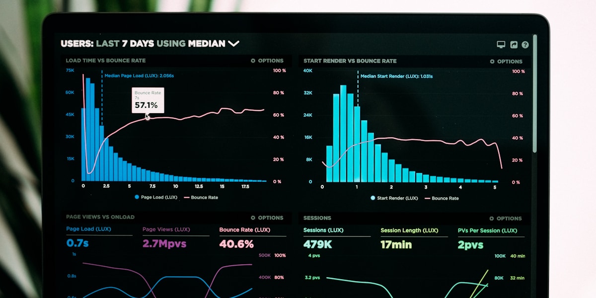
Building Your PMM Dashboard
Great metrics need great dashboards. Here's how to build one that executives actually use.
Dashboard Structure
Executive Summary (Top Level)
- Pipeline generated (launch + ongoing)
- Win rate trending
- Sales cycle length trending
- NRR / expansion revenue
- Key initiative updates
Launch Metrics (Second Level)
- Current quarter launches
- Pipeline by launch
- Adoption rates
- Content engagement
Sales Enablement (Second Level)
- Win rate by competitor
- Training completion
- Content utilization
- Sales feedback scores
Customer Metrics (Second Level)
- NRR trending
- Expansion revenue
- Reference participation
- Case study impact
Tool Recommendations
Tableau / Power BI
- Best for: Custom, complex dashboards
- Skill level: Advanced
- Cost: $$
Looker / Mode
- Best for: SQL-savvy teams, data warehouse integration
- Skill level: Intermediate-advanced
- Cost: $$$
Google Data Studio (Looker Studio)
- Best for: Simple dashboards, Google Analytics integration
- Skill level: Beginner-intermediate
- Cost: Free
Spreadsheets (Google Sheets / Excel)
- Best for: Simple tracking, small teams
- Skill level: Beginner
- Cost: Free
Built-in CRM dashboards (Salesforce, HubSpot)
- Best for: Sales-focused metrics
- Skill level: Beginner
- Cost: Included with CRM
Dashboard Best Practices
1. Show trends, not just snapshots
- Always include time dimension
- Show vs. previous period or target
- Highlight improving/declining metrics
2. Segment your data
- By region, product, competitor, customer segment
- Reveals where you're strong and where you need work
3. Make it actionable
- Each metric should suggest an action
- Low win rate → improve competitive positioning
- Long sales cycle → better enablement or qualification
4. Update regularly
- Weekly for active launches
- Monthly for ongoing metrics
- Quarterly for strategic reviews
5. Share broadly
- PMM team (detailed)
- Sales and product leaders (relevant sections)
- Executive team (executive summary)
Proving PMM ROI
Executives want to know: Is PMM worth the investment?
The PMM ROI Formula
PMM Impact = Revenue influenced × Attribution % - PMM costs
Example:
- PMM team of 5: $1M total cost (salary + tools + programs)
- Revenue influenced: $20M in new ARR
- Attribution: 20% (conservative, multi-touch)
- PMM impact: $20M × 20% - $1M = $3M net impact
- ROI: 3:1
Attribution Models
First-touch attribution
- Pro: Easy to track
- Con: Over-credits early content, under-credits enabling activities
Last-touch attribution
- Pro: Easy to track
- Con: Over-credits demand gen, under-credits PMM
Multi-touch attribution ⭐
- Pro: More accurate picture of influence
- Con: Complex to implement
Recommended: Use multi-touch but also tell stories of clear PMM impact
Building Your ROI Story
Quantitative + qualitative = credible ROI story
Quantitative:
- Pipeline generated: $X
- Win rate improvement: Y percentage points
- Sales cycle reduction: Z days
- Expansion revenue: $X
Qualitative:
- "Sales now confidently wins against Competitor X"
- "Product team uses customer insights to prioritize roadmap"
- "We successfully entered new market segment"
Together: Strong business case
What Good Looks Like: PMM Maturity Model
Level 1: Activity-Based Measurement
- Tracks outputs (battle cards created, trainings delivered)
- No connection to business outcomes
- PMM struggles to prove value
Level 2: Channel Metrics
- Tracks engagement (downloads, views, attendance)
- Starting to measure pipeline
- Beginning to connect to business
Level 3: Business Outcome Focused ⭐
- Tracks revenue impact (pipeline, win rate, expansion)
- Clear attribution models
- PMM can prove ROI
Level 4: Predictive and Strategic
- Leading indicators predict revenue
- PMM metrics inform company strategy
- Data drives PMM prioritization
Most PMM teams are at Level 1-2. Strive for Level 3. Level 4 is rare but powerful.
Common Measurement Mistakes
Mistake 1: Measuring everything
- Choose 5-7 key metrics per quarter, not 50
- Focus on what drives business decisions
Mistake 2: Measuring only activity
- Activities are necessary but not sufficient
- Always tie to business outcomes
Mistake 3: Not segmenting data
- Averages hide important patterns
- Segment by competitor, region, product, customer type
Mistake 4: Inconsistent measurement
- Set measurement cadence and stick to it
- Trending data is more valuable than snapshots
Mistake 5: Data without story
- Numbers alone don't persuade
- Combine quantitative metrics with qualitative context
Final Thoughts
The best PMM measurement system is one that:
- Focuses on business outcomes, not activities
- Is simple enough to maintain consistently
- Tells a clear story about PMM impact
- Drives action (improve what you measure)
- Earns executive trust in PMM's value
Start simple. Track your top 5 metrics religiously for a quarter. Build from there.
Every metric in this guide matters to someone. Your job is to pick the ones that matter most to your business, measure them consistently, and use them to drive better decisions.
Product marketing is increasingly a data-driven discipline. The PMMs who can prove their impact with metrics will earn bigger budgets, larger teams, and more strategic influence.
Measure what matters. Prove your impact. Build the PMM function your company needs.
Kris Carter
Founder, Segment8
Founder & CEO at Segment8. Former PMM leader at Procore (pre/post-IPO) and Featurespace. Spent 15+ years helping SaaS and fintech companies punch above their weight through sharp positioning and GTM strategy.

StoryHQ
Create beautiful marketing documents in minutes. Professional ebooks, case studies, and product briefs without design skills.
Learn moreReady to level up your GTM strategy?
See how Segment8 helps GTM teams build better go-to-market strategies, launch faster, and drive measurable impact.
Book a Demo